Maps have been essential tools for navigation, education, and exploration for centuries. They help us understand our world, but they also come with inherent distortions due to the challenge of representing a three-dimensional globe on a two-dimensional surface. These distortions vary depending on the type of map projection used. One of the most commonly used projections, especially in digital maps, is the Web Mercator projection (EPSG:3857). While convenient for certain applications, it can significantly distort the size and shape of landmasses, leading to misconceptions about the true size of countries and continents.
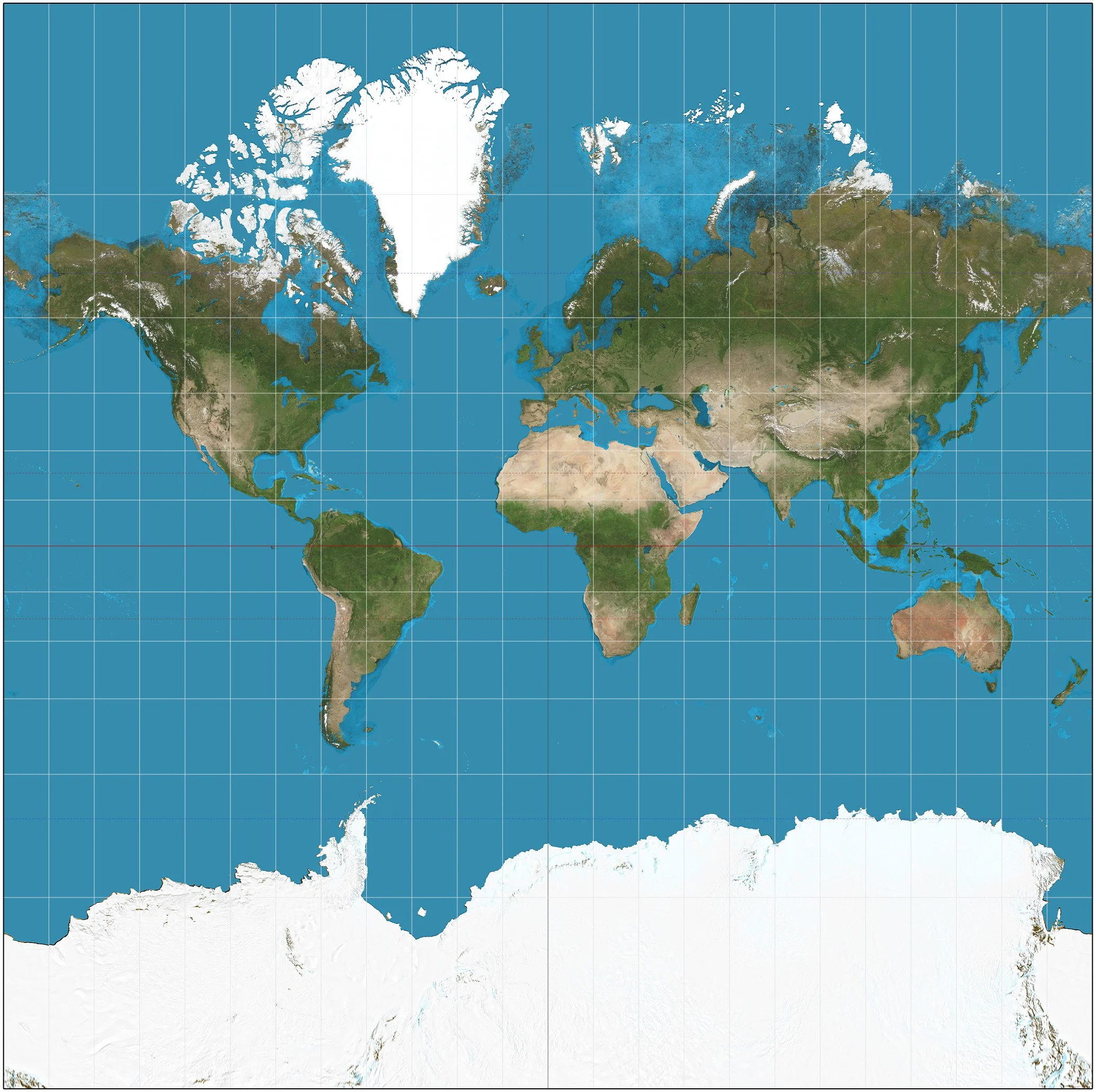
The web mercator projection (image from Wikipedia).
Map Projections
A map projection is a method by which the curved surface of the Earth is represented on a flat surface. Since it's impossible to flatten a sphere without some distortion, every map projection distorts the Earth in some way. These distortions can affect the shape, area, distance, or direction of landmasses. Different projections have been developed to prioritize and minimize specific types of distortions depending on the map's purpose. For example, the Robinson projection seeks to balance distortions in size and shape, while the Mercator projection preserves accurate directions, making it valuable for navigation.
The Web Mercator Projection
The Web Mercator projection is a variant of the traditional Mercator projection, adapted for modern web use. This projection is particularly well-suited for online maps because it uses a system of square tiles that allow for seamless zooming and panning, enhancing the user experience on platforms like Google Maps. The uniform grid system simplifies the task of displaying maps at various zoom levels and facilitates the integration of different data layers.
Despite its advantages, the Web Mercator projection has notable downsides, especially when it comes to representing the true size of landmasses. One of the primary issues is that it greatly exaggerates the size of regions closer to the poles while shrinking those near the equator. For instance, countries like Russia, Greenland, and Canada appear much larger than they actually are, while equatorial regions like Africa and South America are significantly reduced in size.
Visualizing Distortion with TheTrueSize.com
To better understand these distortions, tools like TheTrueSize.com allow users to compare the actual size of countries by moving them around the map. For example, when you drag Greenland down to the equator, it becomes apparent just how small it is compared to its appearance in the Web Mercator projection. This visual comparison helps to correct misconceptions about the relative sizes of different regions around the world.
Greenland, as it would appear at the equator using the Web Mercator projection. Visualised from TheTrueSize.com.
Indonesia: The Archipelago Misunderstood
Indonesia is often perceived as a small cluster of islands, a misconception perpetuated by map distortions. In reality, Indonesia is a vast archipelago comprising over 17,000 islands, with a total land area of approximately 1.9 million square kilometers. From its westernmost point in Sumatra to its easternmost point in Papua, Indonesia stretches over 5,000 kilometers. This makes it wider than the contiguous United States and about the same width as the distance from London to Tehran.
Using TheTrueSize.com, we can compare Indonesia with other countries and continents to reveal its true size. Despite being fragmented into thousands of islands, Indonesia's total area surpasses that of many larger-appearing nations when viewed on a Web Mercator map.
Indonesia, as seen on TheTrueSize.com
Comparing Indonesia's True Size
Russia: While Russia remains the largest country in the world by area, spanning over 17 million square kilometers, the comparison shows Indonesia as more significant than typically thought when adjusted for projection distortions.
Indonesia compared to Russia, as seen on TheTrueSize.com
Europe: If we slide across, you can see that it is larger than all of Europe.
Indonesia compared to Europe, as seen on TheTrueSize.com
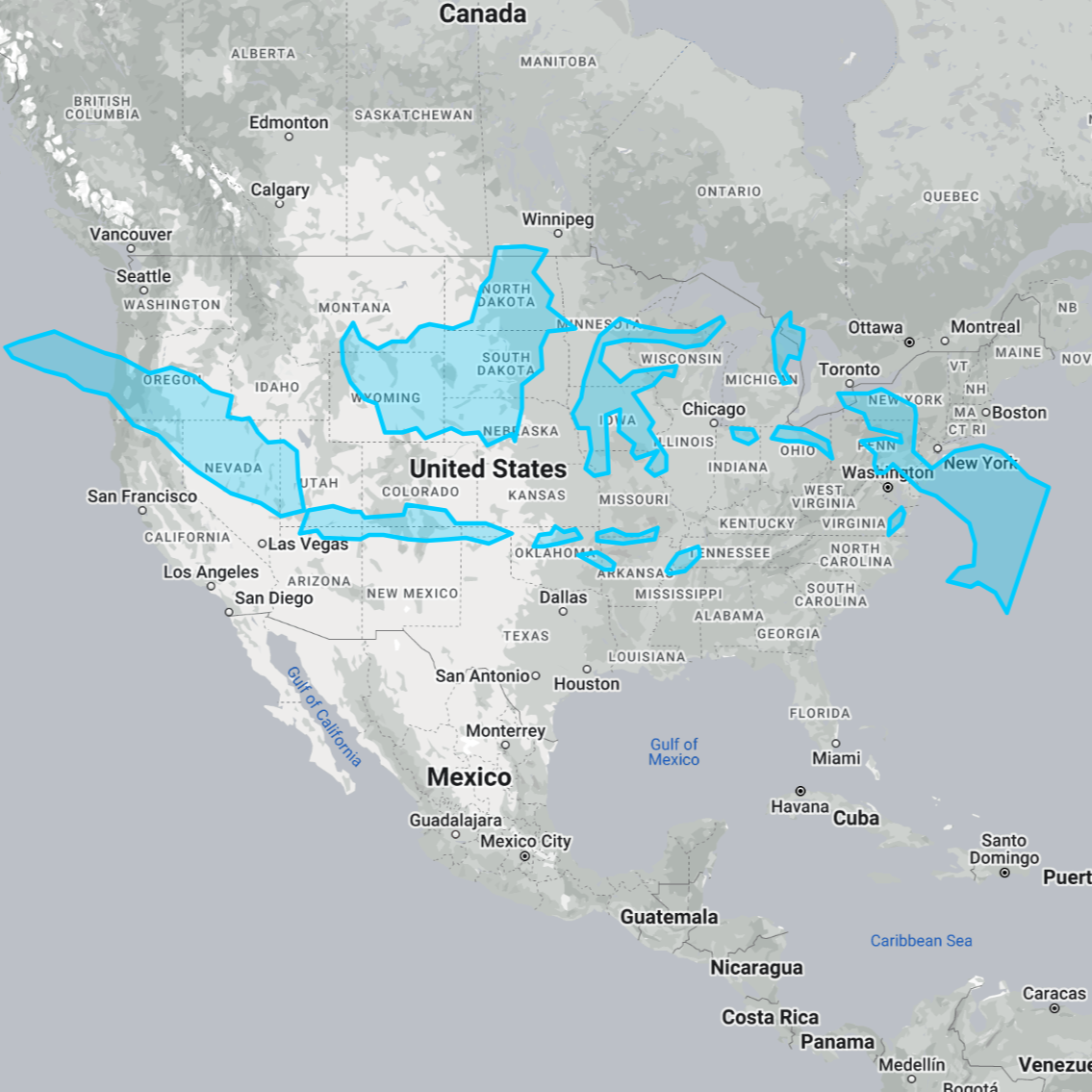
USA: The contiguous United States covers around 8 million square kilometers. Indonesia's east-to-west width rivals the width of the US, challenging the perception of it as a small nation.
Indonesia compared to the USA, as seen on TheTrueSize.com
South America: With a land area of 17.8 million square kilometers, South America dwarfs Indonesia, yet placing Indonesia over the continent helps emphasize its extensive east-west expanse.
Indonesia compared to South America, as seen on TheTrueSize.com
Map projections are powerful tools, but they come with limitations and distortions that can shape our understanding of the world. The Web Mercator projection, while useful for web mapping applications, distorts the size of landmasses, particularly near the poles and equator. Using interactive tools like TheTrueSize.com, we can better appreciate the actual dimensions of countries like Indonesia, challenging misconceptions and gaining a more accurate perspective of our world. Indonesia, far from being a small cluster of islands, is a vast and significant landmass with a rich and diverse geography that deserves recognition on the global stage.


